How to Use Color in Design to Boost Impact
Nov 24, 2025

How to Use Color in Design to Boost Impact
Color isn’t just decoration—it’s communication. Whether you’re designing a brand, presentation, website, or piece of content, the colors you choose shape how people feel, think, and respond. Understanding how to use color intentionally is one of the most powerful skills a creator can develop.
In this guide, you’ll learn exactly how to use color in design to boost impact, strengthen your message, and create experiences people remember.
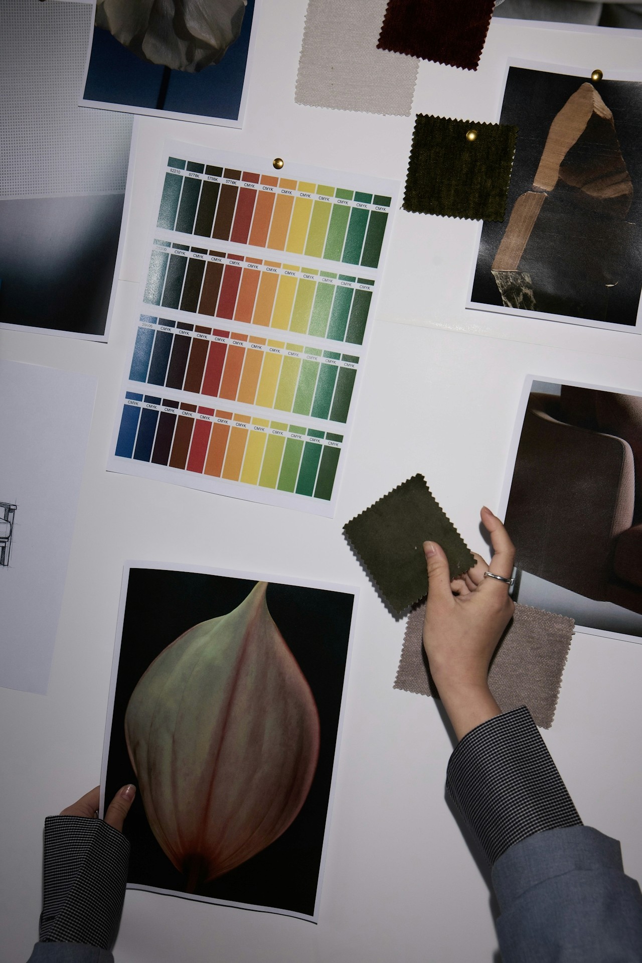
If choosing colors sometimes feels overwhelming, you’re not alone. Color theory can seem overly technical. Online palettes rarely feel “just right.” And even when you find great colors, getting them to work together consistently across your brand, slides, products, or content can feel impossible.
But the challenge isn’t your skill level—it’s the lack of tools built for visual thinkers. Most creators aren’t trying to memorize a color wheel. You simply want colors that feel aligned, intentional, and impactful.
That’s exactly why tools like Moodboard Studio exist: to bridge the gap between intuition and execution, giving creators a clear way to design with confidence. Understanding how color influences perception helps you make smarter design decisions. Here are the essentials every creator should know:
A. Color Sets the Emotional Tone
Colors trigger emotional responses within milliseconds.
Some widely recognized associations include:
Red → urgency, boldness, passion
Blue → trust, calm, clarity
Yellow → optimism, energy, creativity
Green → balance, renewal, growth
Purple → luxury, depth, imagination
When building a design, ask: What emotion should my audience feel at first glance?
B. Contrast Guides Attention
High-contrast combinations (like black + yellow or navy + white) help important elements stand out.
Use contrast intentionally to:
spotlight headlines
emphasize calls to action
create visual hierarchy
make content more accessible
C. Harmony Builds Trust
Color harmony doesn’t mean using colors that match—it means using colors that belong together.
The most effective palettes often follow time-tested patterns such as:
Monochromatic (one hue, many tones)
Analogous (neighbors on the color wheel)
Complementary (opposites that energize each other)
Triadic (three evenly spaced hues)
These relationships keep your visuals cohesive and balanced.
D. Consistency Makes Your Brand Memorable
Whether you're building a presentation, landing page, or product UI, color consistency:
strengthens brand identity
speeds up design decisions
improves user experience
builds recognizability
This is where creators often struggle—keeping colors unified across multiple projects. Moodboard Studio solves this beautifully.
Color becomes effortless when you have the right workflow—and Moodboard Studio was designed to support exactly that.
Here are a few ways it elevates your creative process:
1. Build Moodboards That Clarify Your Vision
Drag in images, textures, brand elements, and inspiration to see how colors naturally emerge.
Instead of guessing your palette, you see it come to life visually.
2. Extract Professional Color Palettes Instantly
Moodboard Studio can pull cohesive palettes directly from your moodboard or images, giving you:
Hex codes
Tonal variations
Accent colors
Background-safe colors
No more guessing. No more mismatched tones.
3. Test Colors in Real Layouts
Preview your palette across:
Hero sections
Buttons
Slides
Product cards
Social templates
Seeing colors in context is what transforms a good palette into a powerful design system.
4. Stay Consistent Across Every Project
Your saved palettes sync across your workspace so you can reuse the same visual language effortlessly—ideal for brand-building, team collaboration, and client work.
When your colors stay consistent, your message stays clear.
Color is one of the fastest ways to transform your work from “looks fine” to “looks unforgettable.” And now, you don’t have to do it alone—or rely on guesswork.
Start your next project in Moodboard Studio and watch how quickly clarity and creativity click into place.
Let your colors tell your story—beautifully, strategically, and with intentional impact.