Design Shouldn’t Be This Hard: What Needs to Change
Feb 18, 2026

Design Shouldn’t Be This Hard: What Needs to Change
Design should be creative. Strategic. Energizing. So why does it so often feel chaotic, frustrating, and harder than it needs to be? If you’ve ever struggled with unclear client feedback, endless revisions, scattered inspiration, or misaligned creative direction, you’re not alone. The truth is simple:
Design shouldn’t be this hard.
And if it is, something in the process needs to change. At Ideate Workspace, we believe better systems create better creative outcomes. Let’s break down what’s broken in today’s design workflow — and how to fix it.
Why Design Feels Harder Than It Should
Before we talk about solutions, let’s acknowledge the reality.
Design today often feels:
Overwhelming
Disorganized
Reactive instead of strategic
Dependent on endless back-and-forth
Hard to communicate and even harder to align
You start with excitement and inspiration. Then things unravel:
Feedback comes in vague: “Can we make it pop?”
Clients send Pinterest boards with no context.
Stakeholders disagree on direction.
Revisions stack up.
Timelines slip.
Suddenly, what should have been a clear creative process becomes a guessing game.
The issue isn’t talent. It isn’t creativity.
It’s alignment. Most design problems aren’t design problems. They’re communication and clarity problems. And that’s where change needs to begin.
What’s Actually Broken in the Design Process
If we’re being honest, the traditional design workflow is outdated.
Here’s what needs to change.
1. Inspiration Is Scattered
Designers collect references from everywhere:
Pinterest
Instagram
Screenshots
Dribbble
Google Drive folders
Slack threads
There’s no centralized visual direction. No structured curation. Just fragments.
Without organized inspiration, teams lose clarity fast.
2. Feedback Lacks Context
Clients and collaborators often struggle to articulate what they want.
They know what they don’t like. But explaining what they do want? That’s harder.
When there’s no shared visual language, feedback becomes subjective and inconsistent.
That leads to:
Endless revisions
Frustration on both sides
Scope creep
Creative burnout
3. The Vision Lives in One Person’s Head
Too often, the creative direction isn’t clearly documented.
It lives in:
A designer’s intuition
A founder’s mental image
A scattered set of saved references
When the vision isn’t visible, alignment becomes impossible.
4. Collaboration Tools Weren’t Built for Designers
Most teams rely on:
Slide decks
PDFs
Email threads
Messaging apps
These tools weren’t designed for visual alignment. They were built for information sharing, not creative direction. That disconnect creates friction.
And friction makes design feel harder than it should.
What a Better Design System Looks Like
So what needs to change? We need to move from scattered inspiration to structured clarity.
From reactive revisions to proactive alignment. From guessing to visual agreement. Here’s what that looks like in practice.
Step 1: Start With a Centralized Mood Board
Mood boards aren’t just aesthetic collages.
They’re alignment tools.
When done right, they:
Define visual direction early
Clarify tone and brand personality
Create a shared reference point
Reduce misinterpretation
Instead of explaining “modern but warm,” you show it.
Instead of saying “minimal but bold,” you visualize it.
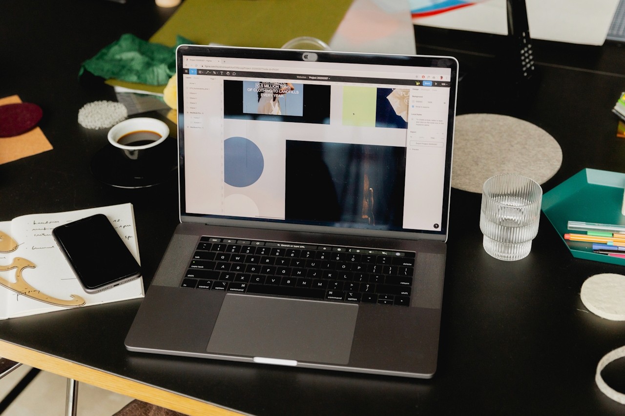
That’s where Moodboard Studio changes the game.
How Moodboard Studio Simplifies the Creative Process
Moodboard Studio was built to fix the friction in design workflows.
Instead of scattered references and messy presentations, you get:
A clean, visual workspace
Organized inspiration in one place
Real-time collaboration
Structured feedback
Clear visual storytelling
You’re not just gathering images. You’re building direction.
When clients and teams can see the vision clearly, everything changes:
Fewer revisions
Faster approvals
More confident creative decisions
Better final results
Design stops feeling chaotic — and starts feeling strategic.
Step 2: Align Before You Design
One of the biggest mistakes in creative work is jumping into execution too quickly.
Design shouldn’t start with mockups.
It should start with alignment.
Using a visual alignment tool like Moodboard Studio allows you to:
Confirm color direction
Validate typography styles
Explore brand mood
Align on layout inspiration
Set expectations before production
This step alone can cut revisions dramatically.
And that’s a shift every creative team needs.
Step 3: Make Feedback Visual, Not Abstract
Traditional feedback sounds like this:
“It feels off.”
“Can we make it more premium?”
“It needs something.”
That’s not actionable.
Visual feedback inside a structured mood board changes the conversation.
Now feedback becomes:
“We prefer this typography style.”
“Let’s lean more into this minimalist direction.”
“This color palette feels more aligned.”
Clarity replaces confusion.
And when clarity increases, friction decreases.
Step 4: Make the Process Scrollable and Digestible
Modern content consumption habits matter — even in design collaboration.
Research consistently shows that users engage more with visual, scannable, and scroll-friendly layouts. In fact, most people decide whether to engage with content in under a minute.
That applies to design presentations too.
Instead of overwhelming stakeholders with long PDFs or 40-slide decks, create structured, scrollable visual boards.
Keep it clear.
Keep it intentional.
Keep it digestible.
Moodboard Studio was designed with this in mind — allowing teams to present visual direction in a way that’s easy to consume and approve.
Why This Matters for Designers, Agencies, and Brands
When design feels harder than it should, the consequences ripple outward:
Projects slow down
Budgets stretch
Creativity suffers
Client trust erodes
But when alignment happens early, the opposite occurs:
Timelines tighten
Confidence grows
Teams collaborate better
The final output improves
This isn’t just about efficiency.
It’s about protecting the creative process.
Design should feel collaborative, not combative. Strategic, not stressful.
And that requires better tools.
The Real Shift: From Chaos to Clarity
So if we return to the core question:
Design Shouldn’t Be This Hard: What Needs to Change?
Here’s the answer:
Inspiration must be centralized.
Alignment must happen before execution.
Feedback must become visual and structured.
Collaboration tools must support creative thinking — not fight it.
When those elements are in place, design becomes what it was meant to be:
Clear. Strategic. Intentional.
Rethink Your Design Workflow
If your current creative process feels heavier than it should…
If revisions feel endless…
If feedback feels unclear…
It’s time to change the system — not the designer.
Moodboard Studio was built for this exact shift.
It helps you:
Organize visual direction
Align teams and clients
Streamline feedback
Reduce revisions
Create with confidence
Design doesn’t need to feel chaotic.
It doesn’t need to feel frustrating.
And it definitely shouldn’t feel harder than it should.
Start building clearer creative direction today.
Try Moodboard Studio and experience what aligned design actually feels like.