Lost in Translation: When Client Feedback Meets Brand Design Reality
Context
We sat down with a brand design agency that was hired to develop a new visual identity for a growing fitness technology company. The client had a strong vision but struggled to communicate it in design terms. What should have been a 4-week branding project became an 8-week journey of feedback interpretation.
The Initial Brief
Client: FitTech Solutions
Project: Visual Identity
Timeline: 4 weeks
Deliverables: Logo, Typography System, Color Palette, Brand Guidelines, Basic Collateral
Budget: $8,500
The Communication Gap
Week 1: Logo Design Feedback
Client's Actual Feedback:
"The logo needs to feel more energetic but also techy. Like Nike meets Tesla, but friendlier. And can we make it feel more... premium? But not intimidating."
Designer's Internal Questions:
What specific elements convey "energy" in this context?
How to balance "techy" with "friendly"?
Which aspects of Nike and Tesla's design language are relevant?
What designates "premium" without being intimidating?
Time Spent:
3 hours analyzing competitor logos
2 hours sketching new concepts
1 hour creating mood boards
1.5 hours in follow-up calls
Week 2: Color Palette Feedback
Client Message:
"These colors feel too fitness-y. We need something disruptive but trustworthy. Maybe make it more vibrant but professional? And can we have colors that stand out but also work everywhere?"
What the Designer Had to Decode:
"Too fitness-y" could mean:
Too similar to competitors
Too bright/neon
Too energetic
Too literal to industry
"Disruptive but trustworthy" might require:
Unexpected color combinations
Traditional color with modern twist
Balance between bold and corporate
Industry pattern breaks
"Vibrant but professional":
Saturation levels
Color psychology
Corporate appropriateness
Print vs. digital considerations
Time Lost: 6 hours exploring color combinations
Week 3: Typography System Feedback
Client Email:
"The fonts feel too stiff. Can we make them more contemporary but timeless? Something that feels innovative like a tech company but accessible like a fitness brand. And make sure it's punchy!"
Translation Challenges:
Defining "stiff" vs "contemporary" in typography
Balancing "innovative" with "accessible"
Understanding what makes type "punchy"
Maintaining readability while being distinctive
Impact:
4 complete typography system revisions
8 hours of work
3 client meetings
Multiple font license purchases
The Breaking Point
Week 4 Feedback:
"The brand guidelines don't quite capture our essence. We need it to feel more cutting-edge but also human. Like Apple meets Peloton, but with our own twist. And the visual language needs more personality, but keep it clean."
This single piece of feedback led to:
6 different interpretations
12 hours of design exploration
4 rounds of revisions
Complete rework of mood boards
What a Feedback Translator Could Have Done
Example 1: Logo Feedback Translation
Original Feedback:
"More energetic but also techy. Like Nike meets Tesla, but friendlier."
Translated Action Items:
You might consider maintaining the current geometric base structure but softening the corners with a 2px radius.
It could be worth exploring the incorporation of a dynamic angle (12-15 degrees) in key elements.
Adding movement through asymmetrical balance might create a more dynamic composition.
Reducing negative space by 20% could result in a denser and more impactful mark.
Trying round terminal points may enhance the design's approachability.
Example 2: Color Palette Translation
Original Feedback:
"Too fitness-y. Need something disruptive but trustworthy."
Translated Design Tasks:
Consider shifting the primary blue from RGB(0,122,255) to RGB(28,45,130).
You might explore introducing an unexpected secondary color, such as deep coral RGB(255,111,97).
It could be beneficial to add a sophisticated neutral gray palette with five tones.
Developing a high-contrast accent color system could enhance visual hierarchy.
You may want to create color combinations that break industry patterns for a fresh and unique approach.
Example 3: Typography Translation
Original Feedback:
"More contemporary but timeless. Innovative but accessible."
Translated Actions:
You might explore switching to Neo Sans for headlines to evoke a modern, tech-inspired feel.
Consider pairing it with a humanist sans-serif for body text to create a balanced and readable contrast.
It could be interesting to implement custom letter-spacing, such as -10 tracking, for headers to enhance their impact.
Developing distinctive number styling for data display might add a unique and polished touch.
You may want to create a custom icon set that aligns harmoniously with the typography.
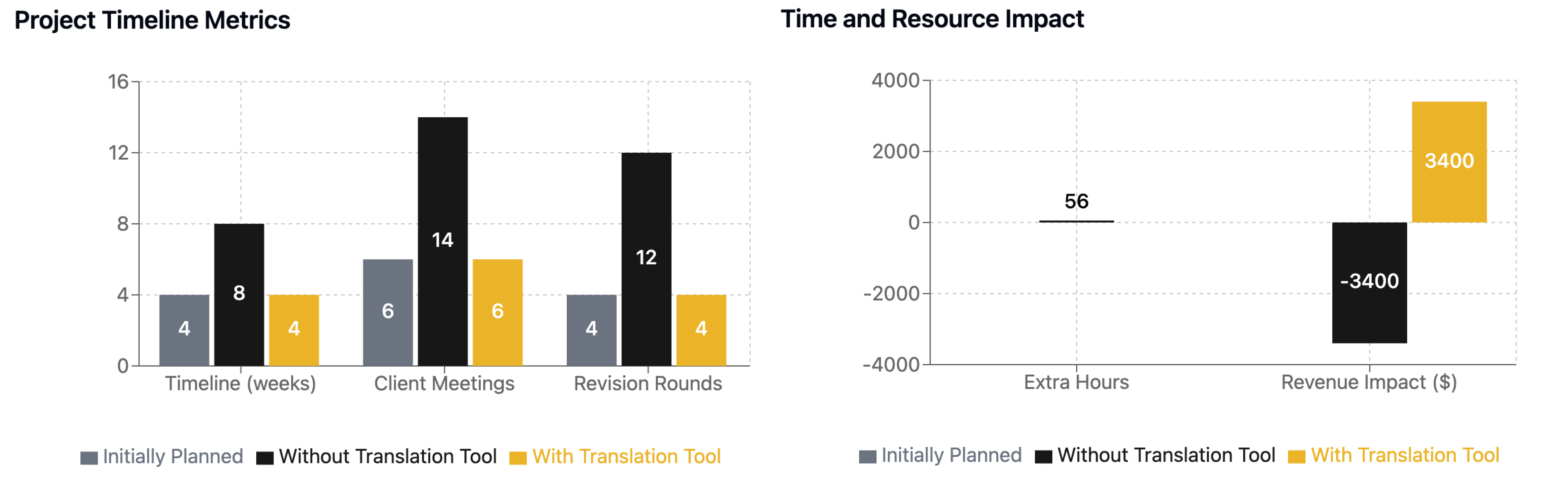
Time and Cost Impact
Key Learnings
Translation Pain Points
Abstract brand attributes need concrete design specifications
Competitive reference needs specific element extraction
Emotional brand values need visual translation
Industry positioning must become design decisions
Critical Translation Needs
Conversion of brand attributes to design specifications
Analysis of competitor design elements
Translation of brand values to visual elements
Generation of specific design modification tasks
Conclusion
The case study demonstrates how a feedback translation tool could have:
Saved 56 hours of interpretation time
Prevented 4 weeks of project delays
Maintained project profitability
Reduced client meetings by 57%
Improved client-designer relationship
Preserved design integrity through revisions
As we onboard 20 hand-selected designers into our MVP in the coming weeks, we’re eager to validate these hypotheses and revolutionize how designers bridge the gap between client feedback and creative execution.